Pre-defined Absolute and Relative Sized Fonts in CSS
Today I learned about pre-defined absolute and relative font sizes that you can use in CSS apart from the usual px, em, rem, vw, vh, etc. units.
These are
xx-small,x-small,small,medium,large,x-large,xx-large, andxxx-large. These are the absolute font sizes and they are relative to the user’s default font size.
Sounds familiar? Well, these font sizes sound exactly how we label sizes on our clothes.
Essentially, these font sizes are relative to the user’s default font size. So, if the user’s default font size is 16px, xx-small will be 9px, x-small will be 10px, small will be 13px, medium will be 16px, large will be 18px, and so on.
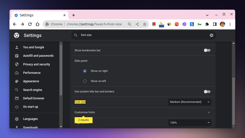
The user’s default font size can be changed in the browser’s settings. For instance, in Chrome, you can change it by going to Settings > Appearance > Font size.
Apart from these absolute font sizes, there are relative font sizes as well which are smaller and larger. These are relative to the parent element’s font size.
So, if the parent element’s font size is 16px, smaller will be 13px and larger will be 18px.
These pre-defined font sizes come in handy when you want consistency in the font sizes without having to define them manually. And since we have a wide variety of font sizes to choose from, we can use them in a way that makes sense for a particular use case and create design systems around them.
On top of that, it also respects the user’s default font size which is a good thing.

👋 Hi there! This is Amit, again. I write articles about all things web development. If you enjoy my work (the articles, the open-source projects, my general demeanour... anything really), consider leaving a tip & supporting the site. Your support is incredibly appreciated!
