How to create a two column layout using Flexbox in CSS
This blog has got this two-column layout which houses host of different things for different purposes. A two-column layout is especially useful if you want to repeat a certain column on every page.
In my case, it’s the right column which gets repeated on every page because it contains a newsletter box, a recently published articles’ container, and a few ads. I wanted these things on every page. And hence a two-column layout was inevitable.
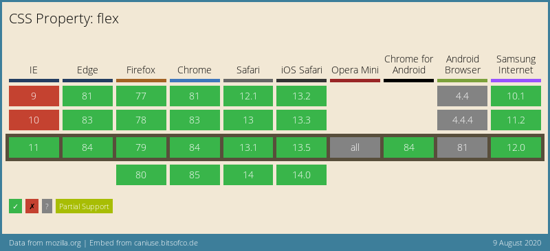
I’ve built this two-column layout using Flexbox. And I’ll tell you it’s rather easy to create one from my experience. Apart from this, the support for Flexbox is quite widespread across all the newest browsers as you can see below.
So, let’s jump into it right away.
First, we’ll need to create a parent container which will house the two column/div like so.
<div class="flex-container">
    <!-- this will hold the two column layout -->
</div>
Now, as you can see, I’ve given this div a class called flex-container. Let’s define that in the CSS.
.flex-container {
    display: flex;
    flex-direction: row;
}
As you can see, I’ve made the div a Flexbox by setting the display property to flex. Also, we have set the flex-direction property to row which will set the two divs (that we’re going to add next) side-by-side. Let’s add these two divs to the flex-container like so.
<div class="flex-container">
    <div class="flex-left">
        This will have content in the left box.
    </div>
    <div class="flex-right">
        This will have content in the right box.
    </div>
</div>
We now have two columns called flex-left and flex-right respectively. Let’s define its CSS.
.flex-left {
    width: 75%;
    height: 100vh;
}

.flex-right {
    width: 25%;
}
This just set the widths of the columns that we would like to see. In my case, I’ve set the width of left column to 75% of the entire window and 25% for the right column. Also, set the height property to 100vh so that it takes the height of the whole window.
You may like: Break HTML content into newspaper-like columns using pure CSS
And that’s about it! That’s all you need to create a nice two-column layout for your website. See it in action in this CodePen below.
See the Pen Two column layout by Amit Merchant (@amit_merchant) on CodePen.
As you may notice, I’ve added borders, margins and paddings to the columns so things look more sophisticated and visible.
Make it responsive
You can make this layout responsive for mobile devices by changing the flex-direction of the container to column which will stack the columns on top of each other and set the width of both the columns to 100%. I’ve done exactly the same on this blog.
Something like following.
See the Pen Two column layout (Responsive) by Amit Merchant (@amit_merchant) on CodePen.

👋 Hi there! This is Amit, again. I write articles about all things web development. If you enjoy my work (the articles, the open-source projects, my general demeanour... anything really), consider leaving a tip & supporting the site. Your support is incredibly appreciated!
