Implementing scroll snap using only three lines of CSS
If you’re not under the rock and using the internet for quite some time, you most probably have stumbled upon one of these websites where when you scroll through the website, portions of it snap to the viewport automatically.
This behavior is called as “scroll snapping”. Take Tesla’s website for example.
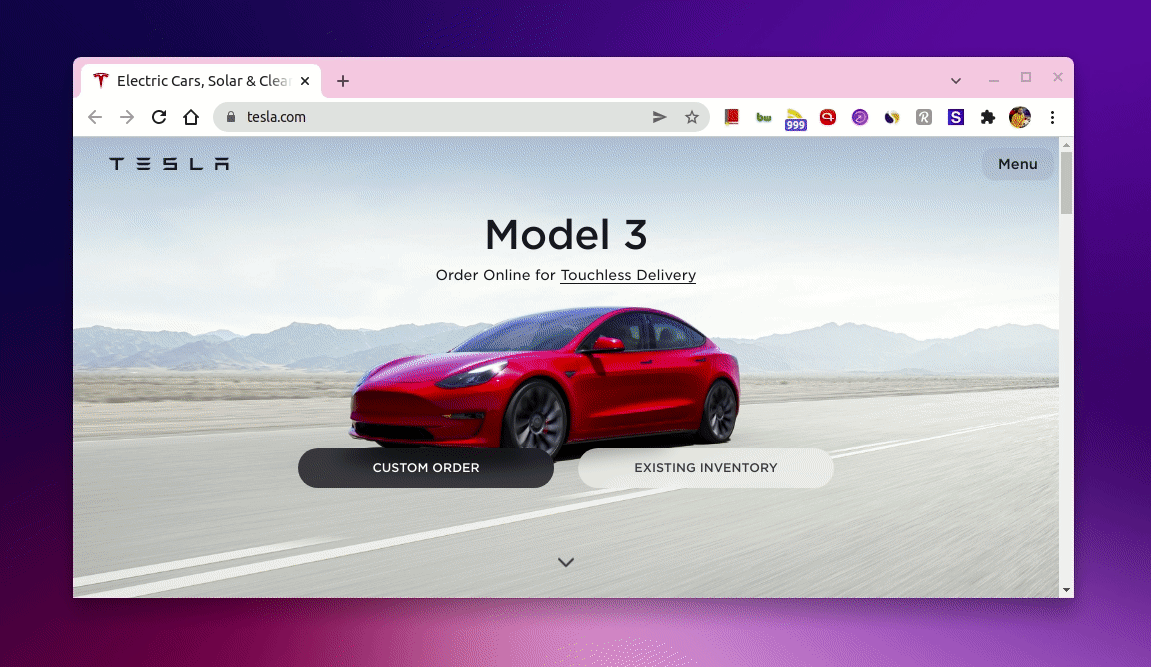
As you can tell, a section of new products is being snapped to the viewport automatically on a small stroke of a scroll as I scroll on tesla.com.
Turns out, it’s pretty easy to achieve this kind of rich scroll snapping behaviors purely using CSS. In fact, using only three lines of CSS!
So, let’s see how we can do it.
The HTML Skeleton
To implement something like what we have seen on tesla.com, first, we’ll need a container and inside that container, we can keep the children <div>s that would act as scroll-snap areas.
So, our HTML skeleton would look something like this.
<div class="container">
  <div>Child 1</div>
  <div>Child 2</div>
  <div>Child 3</div>
</div>
The magic CSS
Now, to make the scroll-snap work, first, we need to set two CSS properties called overflow-y and scroll-snap-type on the container like so.
.container {
  overflow-y: scroll;
  scroll-snap-type: y mandatory;
}
Here, we set the overflow-y to “scroll” since we need the scroll snap behavior vertically.
The scroll-snap-type CSS property sets how strictly snap points are enforced on the scroll container in case there is one.
Here, y indicates that the scroll container snaps to snap positions in its vertical axis only and mandatory determines the visual viewport of this scroll container will rest on a snap point, it snaps on that point when the scroll action is finished, if possible.
Next, we need to set the scroll-snap-align CSS property to “center” for the container children like so.
.container div {
    scroll-snap-align: center;
}
The scroll-snap-align property makes sure the box’s (here the children <div>s) snap position as an alignment of its snap area within its snap container’s snapport (as the alignment container). Setting it to center will align the box’s scroll snap area to the center of the scroll container’s snapport on the Y-axis in our case.
And that’s it! That’s all you need to implement a working scroll snap behavior.
Also, the great thing about this is, all the properties I mentioned here are being widely supported in all supported browsers. So, you can use them in the production as well.
In action
If we put all of these together with some additional CSS, here’s how it would look like.
See the Pen Scroll snap with CSS by Amit Merchant (@amit_merchant) on CodePen.
Try scrolling through the page and you’ll see the scroll-snap behavior in action!
Conclusion
And that’s how you can implement the scroll snapping for your website using as little CSS possible and no JavaScript!
So, if you want to implement the behavior horizontally, you can just replace the x with y in the property values I mentioned previously and you’ll have a horizontal scroll snapping behavior at your disposal in no time.

👋 Hi there! This is Amit, again. I write articles about all things web development. If you enjoy my work (the articles, the open-source projects, my general demeanour... anything really), consider leaving a tip & supporting the site. Your support is incredibly appreciated!
