Prevent Image Layout Shift Using CSS
When you are working with images on your website, the issue of the layout shift that comes with it is real and pretty annoying at times.
To show you how this layout shift looks like, I have created a simple demo that you can take a look at below.

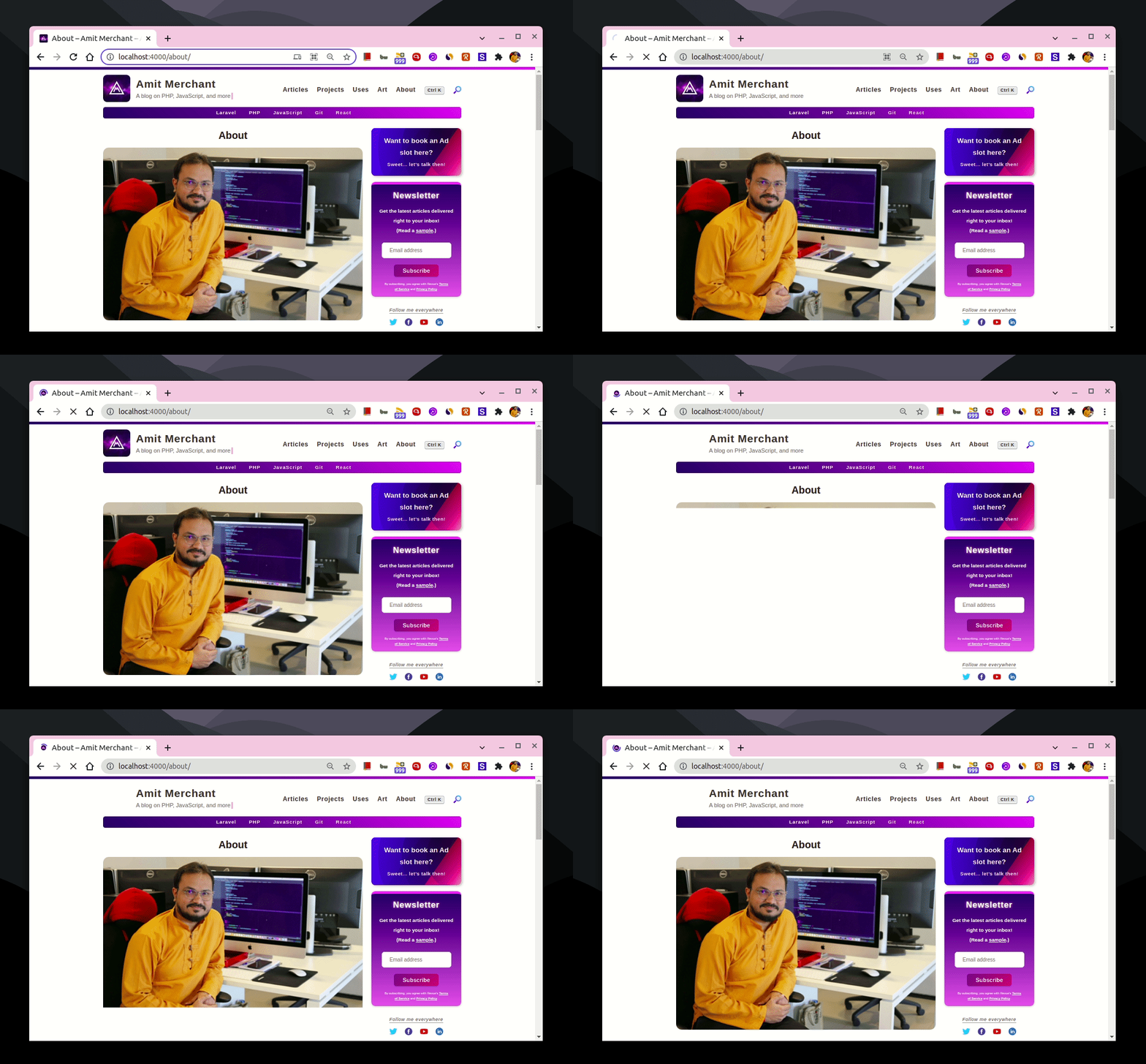
As you can tell, when the images are not handled correctly, the content that lies beneath the image will appear first and then shifts below as the image starts loading.
This is a kind of weird and not-so-good user experience and should be solved. When solved, it should look like this.

This obvious way (and the one you might want to reach first) to fix this is to give width and height to the image. But this quickly fails when your website deals with responsiveness.
In this article, I’ll discuss one of the ways to mitigate this issue with an example (even in the different viewports of the website).
The problem
Let’s say we have the following layout where we have an image and text-based content stacked on top of each other just like how I discussed above.
<div class="container">
  <div class="content">
    <img src="https://picsum.photos/seed/picsum/450/200" alt="Cool image">
    <p>
      Lorem ipsum dolor sit amet, consectetur adipiscing elit. Morbi efficitur, nunc sit amet ornare volutpat, diam augue tempor sapien, tempus ullamcorper arcu est hendrerit quam. Vestibulum sodales id nisl sed aliquet. Vestibulum aliquam dolor ut diam egestas elementum. Aliquam commodo est non nisi tristique, non congue libero mattis. Sed lorem felis, blandit a nibh a, accumsan porttitor nisl. Mauris ornare euismod accumsan. Aenean in massa facilisis, tincidunt diam vel, dignissim velit. Suspendisse sed dignissim urna. Quisque orci tellus, hendrerit nec tempus at, bibendum at justo. Fusce vitae scelerisque felis, vel porta velit.
    </p>
    <p>
      Praesent malesuada lacinia mauris nec imperdiet. Maecenas a tellus condimentum, efficitur nunc sed, rhoncus lorem. Nam et ante id tortor lobortis ultricies. Suspendisse scelerisque nulla sapien, eu rhoncus est fringilla eu. Duis risus mi, condimentum vitae porttitor eget, convallis eu nulla. Donec ultrices velit a lorem pellentesque laoreet. Class aptent taciti sociosqu ad litora torquent per conubia nostra, per inceptos himenaeos. Lorem ipsum dolor sit amet, consectetur adipiscing elit. Suspendisse diam ante, hendrerit sed pretium viverra, consequat eget arcu. Mauris sed facilisis neque. Mauris id ligula velit. Curabitur lobortis dignissim dui non eleifend. Praesent rhoncus viverra dui, ac suscipit tellus consectetur id. Sed non tincidunt justo, non iaculis eros. Pellentesque sodales aliquam est in sodales. Nunc et tortor interdum, congue augue sed, euismod nisl.
    </p>
  </div>
</div>
And the CSS (in this case I’m using SCSS).
.container {
  display: flex;
  align-items: center;
  justify-content: center;

  .content {
    width: 50%;

    img {
      width: 100%;
    }
  }
}
If we put this all together, this is how it all looks like.
See the Pen Image Layout Shift Demo by Amit Merchant (@amit_merchant) on CodePen.
If you’ll open this pen and do the browser’s network throttling to the lowest speed, you’ll be able to notice the layout shift since we haven’t handled the scenario yet.
Let’s tackle this out!
The solution
To fix this, first, we will need to wrap the image in a container like so.
<div class="image-container">
    <img src="https://picsum.photos/seed/picsum/450/200" alt="">
</div>
Next, we need to set the position of this image-container as relative and the position of the image as absolute.
.image-container {
    position: relative;

    img {
        width: 100%;
        position: absolute;
    }
}
Since we have set the position of the image as absolute, we need to set the top and left properties to 0. Also, to avoid any sort of stretch in the image we can set object-fit to cover.
.image-container {
    position: relative;

    img {
        width: 100%;
        position: absolute;
        top: 0;
        left: 0;
        object-fit: cover;
    }
}
The last thing that we need to do is, we need to set the aspect ratio of the image. We can do this by using the padding-top property and setting it based on the aspect ratio of the image.
In the supported browsers, you can use the aspect-ratio property instead of the
padding-tophack.
.image-container {
    position: relative;
    padding-top: 44%;

    img {
        width: 100%;
        position: absolute;
        top: 0;
        left: 0;
        object-fit: cover;
    }
}
We can make things more cleaner by applying a color to the image-container which will appear when the image is loading, instead of showing the background color of the document itself.
.image-container {
    padding-top: 44%;
    position: relative;
    background: #d1c4e9;

    img {
        width: 100%;
        position: absolute;
        top: 0;
        left: 0;
        object-fit: cover;
    }
}
And that’s it! Now, the layout won’t shift when the image starts loading in the DOM. Instead, it will show the nice background color of your choice in place of the image when the image hasn’t started loading yet!
Here’s how it all looks like when put it all together.
See the Pen Image Layout Shift Fixed Demo by Amit Merchant (@amit_merchant) on CodePen.
👋 Hi there! This is Amit, again. I write articles about all things web development. If you enjoy my work (the articles, the open-source projects, my general demeanour... anything really), consider leaving a tip & supporting the site. Your support is incredibly appreciated!


