Render CSS Based on The Browser Support for Features
Providing a wide range of support for the browsers is a great problem to ponder upon when it comes to designing websites using CSS.
For instance, there are still a few sets of browsers that don’t support flexbox yet. And so, if you want to target your website for these browsers as well, you would need to fall back to the techniques that apply specifically to these browsers.
Luckily, CSS comes with a handly little utility using which it’s easier to determine whether the client browser supports a certain CSS feature or not, and based on that it would render the CSS.
I’m talking about the @supports at-rule.
The @supports at-rule
Using the @supports at-rule (also known as a feature query), it’s possible to write a CSS declaration based on the support for certain CSS feature(s).
It’s kind of like Media queries which lets you check and render CSS declarations based on the device’s characteristics and parameters but for checking feature support.
The syntax
The syntax of @supports is also similar to that of the @media at-rule.
@supports <supports-condition> {
  <group-rule-body>
}
As you can tell, you would need to pass in the condition that you would like to check in place of <supports-condition> and a block of CSS declarations that you would expect to be run when the said condition is met in place of <group-rule-body>.
An example
So, for instance, if you want to run a block of CSS only when the browser supports display: flex, you can do it like so.
@supports (display: flex) {
    .container {
        display: flex;
        justify-content: center;
        align-items: center;
    }
}
And if the browser doesn’t support display: flex, it’s easier to fall back to the alternative solution by using the not operator with @supports like so.
@supports not (display: flex) {
    .container {
        display: block;
        float: left;
    }
}
Using multiple conditions
It’s also possible to make use of multiple conditions using the or & and operators.
For instance, if you want to run some CSS only if the browser supports grid and flex both, you can do it like so.
@supports not ((display: grid) or (display: flex)) {
    .container {
        display: flex;
    }

    .box {
        display: grid;
    }
}
And to check if there is at least one condition met from the multiple conditions, you can do it using the or operator like so.
@supports (transform-style: preserve) or (-moz-transform-style: preserve) {
    /* use the transform-style or -moz-transform-style properties here */
}
In closing
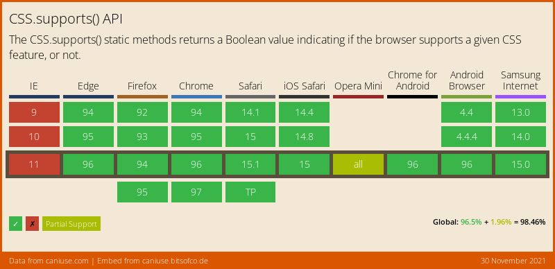
All in all, the @supports rule is a great little utility if used wisely and as I write this, it has been “supported” in most of the modern browsers except Internet Explorer. So, I suppose it’s not a bad idea if you want to use it in the production.

👋 Hi there! This is Amit, again. I write articles about all things web development. If you enjoy my work (the articles, the open-source projects, my general demeanour... anything really), consider leaving a tip & supporting the site. Your support is incredibly appreciated!


