What If UI Components Were Built Like Modular Phones?
Remember the idea of modular phones? Instead of buying a phone with everything fixed into it, you could assemble one using individual modules.
Want a better camera? Swap the camera module. Need a bigger battery? Replace the battery module. Each module had a specific responsibility, and you could combine them to build a phone that suited your needs.
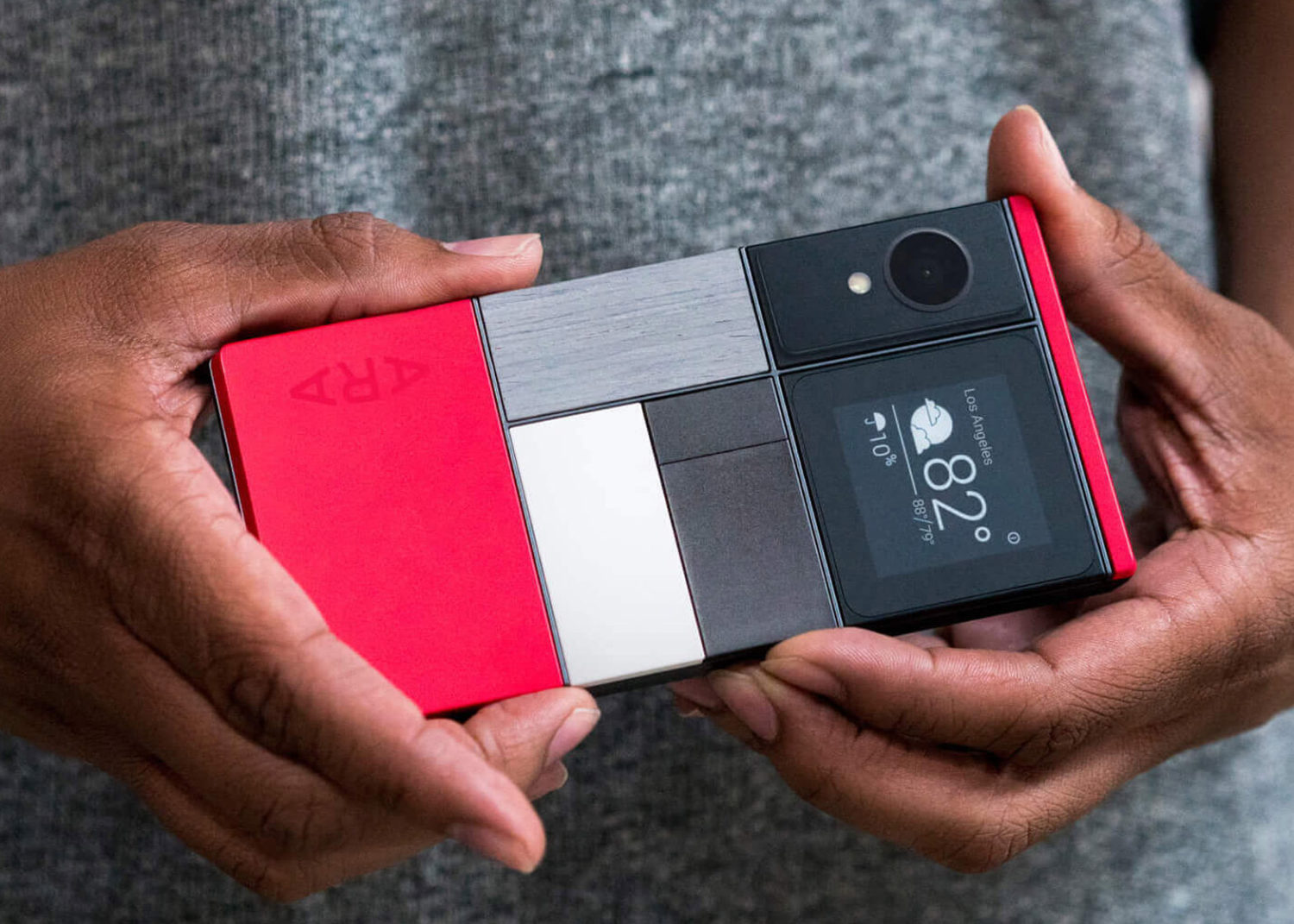 A modular smartphone from Google’s Project Ara
I’ve been thinking about how the same idea could apply to building UI components.
Traditionally, component libraries give us ready-made components such as dropdowns, dialogs, tabs, and date pickers. We pick the ones we need, customise their appearance, and put them together to build an interface.
But what if, instead of relying on complete components, we could build them by combining smaller, reusable behaviours?
For instance, a dropdown isn’t just a dropdown. It involves popup positioning, focus management, keyboard navigation, selection, and dismissal. These are individual behaviours that can be reused across different components.
This is particularly interesting in the context of AI agents. As agents become more involved in building and interacting with web interfaces, there’s a growing need to make components understandable and operable by them as well.
That’s where Vercel’s UI SDK comes in. It’s an interesting take on building UI components using reusable behaviours, with an additional layer that allows AI agents to inspect component state and invoke their actions.
Let’s see how it works.
Building UI Components with Reusable Behaviours
Instead of providing ready-made UI components, UI SDK provides a set of reusable behaviours that you can combine to build your own components.
For example, a dropdown typically needs a few things to work properly:
- Popup positioning and visibility
- Keyboard navigation
- Focus management
- Selection handling
- Dismissal on outside clicks
These are independent behaviours, but they’re often bundled together in a single component. The UI SDK lets you compose them separately, giving you more control over how the final component is implemented.
The SDK provides primitives such as createPopup, createSelection, and createRovingFocus to handle these interactions. You can use them together to build a dropdown, or reuse the same behaviours in a completely different component.
The result is a component that’s built around the behaviours it needs rather than being tied to a predefined implementation.
Here’s what a user picker component might look like when built using the UI SDK:
// user-picker.ts
const userPicker = definePrimitive({
  name: "user-picker",
  api: (context) => {
    const change = createChange(context)
    const popup = createPopup(context, { preset: popoverPreset })
    const listbox = createListbox(context, { key: "highlighted" })
    const selection = createSelection(context, {
      key: "value",
      set: (value, details) => change("value", value, details),
    })

    return { ...popup, listbox, selection }
  },
  slots: (slot) => ({
    trigger: popupTrigger(slot),
    content: popupContent(slot),
    option: slot({ bind: (el, part) => part.api.listbox.bind(el, part) }),
  }),
})
As you can tell, the component is built by combining different behaviours such as popup management, listbox handling, and selection. Each behaviour is encapsulated in its own primitive, making it easier to understand and reuse.
Next, you map those behavior slots to standard HTML elements in your preferred framework (React, Vue, Svelte, Solid, or Web Components) like so.
// user-picker.ts
import { createParts } from "@ui-sdk/react/primitive"

const {
  Root: UserPicker,
  Trigger: UserPickerTrigger,
  Content: UserPickerContent,
  Option: UserPickerOption,
} = createParts(userPicker, {
  trigger: "button",
  content: "div",
  option: "div",
})
Finally, use the generated parts cleanly in your application JSX.
// assign-task.tsx
<UserPicker>
  <UserPickerTrigger>Assign to</UserPickerTrigger>
  <UserPickerContent>
    {people.map((person) => (
      <UserPickerOption key={person.value} value={person.value}>
        {person.label}
      </UserPickerOption>
    ))}
  </UserPickerContent>
</UserPicker>
The biggest advantage with this approach, in my opinion, is that if you later decide the picker needs search-as-you-type filtering, you don’t have to swap out the component for a different library widget; you just add createTypeahead into the definePrimitive block.
On top of the reusable behaviors, the SDK also includes ready-made, unstyled components such as Select, Dialog, Tabs, Combobox and Date Picker. You (or your agent) provide the styling.
Making UI Components Agent-Friendly
There’s one more interesting part of the UI SDK, and that is the Agent Bridge.
As AI agents increasingly interact with web applications, they need more than just access to the DOM. They need to understand what a component does, its current state, and which actions are available.
The Agent Bridge provides a way to expose this information explicitly.
When you initialize components using UI SDK primitives, they automatically register themselves with an internal tracker. Before the page finishes rendering, you instantiate the bridge:
import { createAgent } from "@ui-sdk/react/agent"
const agent = createAgent()
When the AI agent wants to see what is on the page, it calls agent.snapshot(). This returns a clean, lightweight JSON structure outlining every interactive element, its current value, and what operations it accepts:
{
  "ref": "c1",
  "component": "input",
  "label": "Project name",
  "value": "Apollo",
  "actions": ["setValue", "clear"]
}
Now, the agent can execute targeted commands through the bridge’s act() method using the actions array. For example, to change the value of the input above, it would call:
await agent.act({
  steps: [
    { ref: "Project name", action: "setValue", args: ["Atlas"] }
  ]
})
This essentially means an agent doesn’t necessarily have to infer how a component works by inspecting its HTML or simulating user interactions. The component can expose a more meaningful interface for the agent to work with.
In Closing
The interesting thing about Vercel’s UI SDK is how it brings these two ideas together: building UI components from reusable behaviours and making those components understandable to AI agents.
We’ve already got good abstractions for building interfaces for people. As agents become another way of interacting with those interfaces, having components expose their state and capabilities could become just as important.
The Agent Bridge is a step in that direction. It gives developers a way to make their components usable by agents without giving up control over how those interactions happen.

👋 Hi there! This is Amit, again. I write articles about all things web development. If you enjoy my work (the articles, the open-source projects, my general demeanour... anything really), consider leaving a tip & supporting the site. Your support is incredibly appreciated!