Why radio buttons are called radio buttons in UIs?
Ever since I entered into this world of user interfaces, the one thing that I always come across while working are these radio buttons.

Now, element names in UIs are self-describing.
- Inputs are called inputs because we are “inputting” values in them.
- Select dropdowns are called select dropdown because we are “selecting” something out of many options.
- Checkboxes are called checkboxes because, well, we are “checking” multiple options presented to us.
But why the hell does radio buttons are called “radio buttons”? I always wondered. So, I dig into this.
Etymology of Radio Buttons
After some digging, here’s what I found.
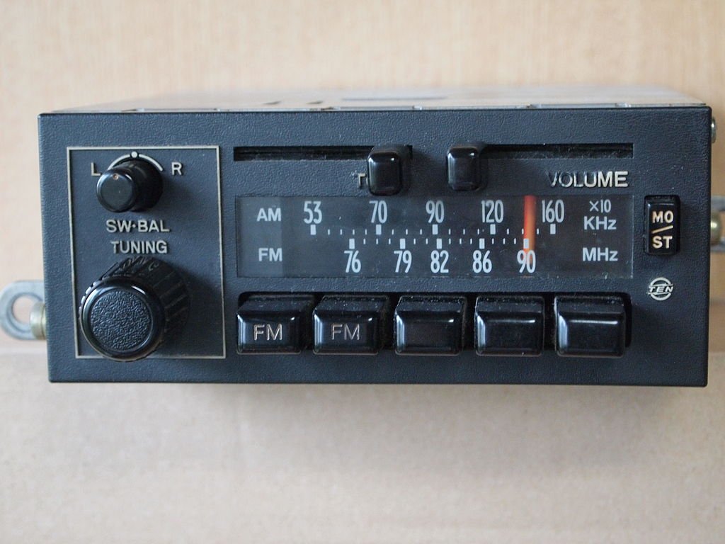
Our loving radio buttons are called “radio buttons” because they are named after the physical buttons used on older radios to select preset stations – when one of the buttons was pressed, other buttons would pop out, leaving the pressed button the only button in the “pushed in” position.
Here’s a photo of one such radio where it has a row of five pop-out buttons (with text “FM”).
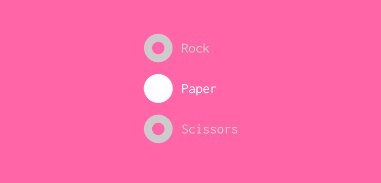
As you can see, the radio buttons in UIs work in a similar fashion where they are normally presented in radio groups (a collection of radio buttons describing a set of related options). Only one radio button in a group can be selected at the same time.
And hence, they are called as “radio buttons”!
Reference: en.wikipedia.org/wiki/Radio_button
👋 Hi there! This is Amit, again. I write articles about all things web development. If you enjoy my work (the articles, the open-source projects, my general demeanour... anything really), consider leaving a tip & supporting the site. Your support is incredibly appreciated!


