Designing websites keeping floating tab bar of Safari 15 (on iOS) in mind
The newest version of Safari, i.e Safari 15, on iOS is great. It comes with an all-new layout and a new way of navigating websites on it.
Essentially, the address bar is now moved to the bottom of the screen and it now adjusts itself as you scroll the website. As you swipe on a webpage, the tab bar minimizes into the bottom of the app. Swipe back up or tap at the bottom to make the tab bar reappear.
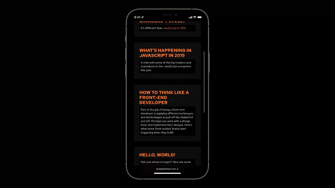
So, for instance, if the website would look something like following when you’re not scrolling along.
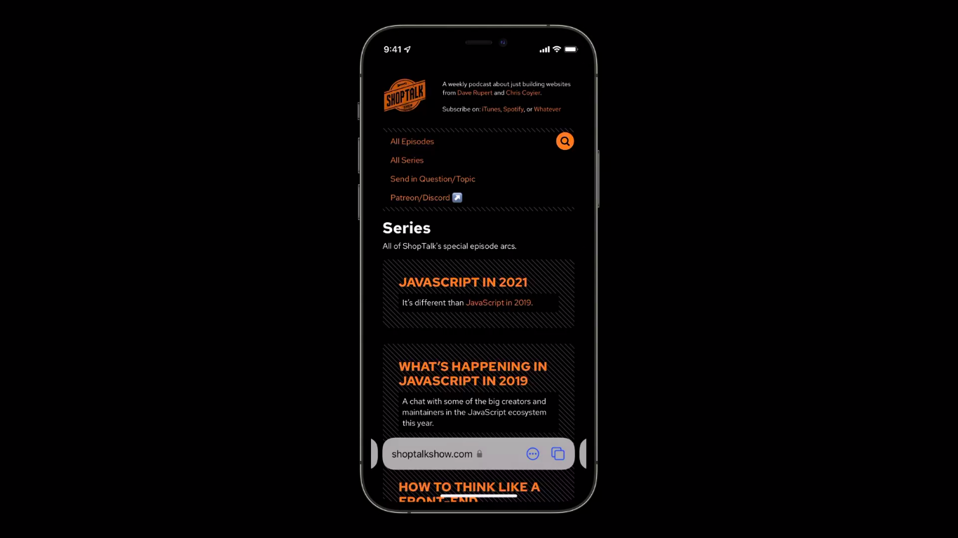
And as soon as you start scrolling, the tab bar/address bar will reappear like so.
This is to make the entire experience of visiting a website more seamless and appealing.
The problem
This improvement/enhancement comes with a shortcoming. The “floating” nature of the tab bar hurts in some scenarios.
Take the following for example.

As you can see, in this example, the tab bar is actually obstructing the footer of the website and it’s really hard to tap on those buttons now.
How to get around this problem?
Well, it turns out, the CSS has its answer in form of safe-area-inset-* properties.
The safe-area-inset-* properties
By using the safe-area-inset-* properties in conjunction with the env(), it’s possible to mitigate this issue.
There are four kinds of safe-area-inset-* properties
safe-area-inset-topsafe-area-inset-rightsafe-area-inset-bottomsafe-area-inset-left
These properties define a rectangle by its top, right, bottom, and left insets from the edge of the viewport, which is safe to put content into without risking it being cut off by the shape of a non‑rectangular display.
In the case of Safari 15, the safe area is the rectangle area that resides above the tab bar (when scrolling) as shown below.
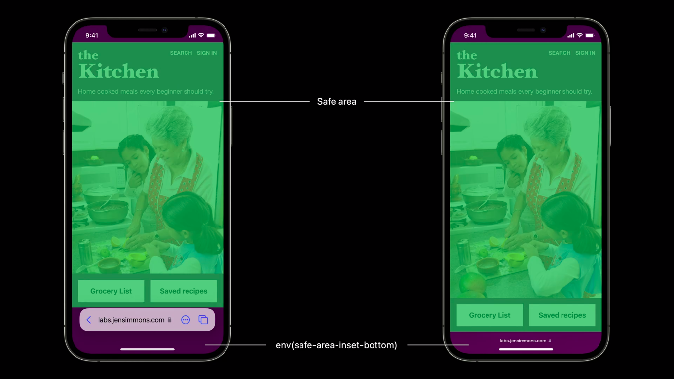
As you can tell, the green area shown in both of the cases defines the safe area and so, we can adjust the design of our website accordingly.
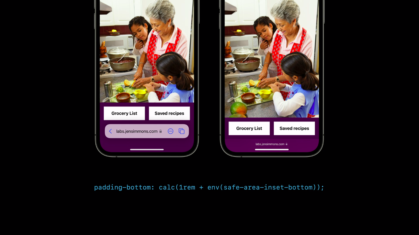
So, if we want to do that, we can use the env() and safe-area-inset-bottom to give the bottom padding that it needs like so.
footer {
    padding-bottom: calc(1em + env(safe-area-inset-bottom));
}
When done, the footer will have that extra padding, thanks to safe-area-inset-bottom. And now, those two buttons won’t be obstructed by the tab bar anymore.
In the usual scenario, let’s say in the Chrome browser, the safe-area-inset-bottom will always be 0. So, the footer would look normal. The safe-area-inset-bottom will only kick in when the website is loaded on Safari 15 on iOS.
And this is how you can make your website compatible with Safari 15 without sacrificing the experience!

👋 Hi there! This is Amit, again. I write articles about all things web development. If you enjoy my work (the articles, the open-source projects, my general demeanour... anything really), consider leaving a tip & supporting the site. Your support is incredibly appreciated!
