Easy shine animation on hover using CSS
The other day, I was pretty bored but I wanted to do something productive. So, what’s the best thing to do when you’re bored? You, of course, play around with hover effects on your logo and that’s exactly what I did.
I wanted to create a smooth shine/shimmer effect on my logo when the user hovers over it. So, I did some research and found out that it’s pretty easy to do.
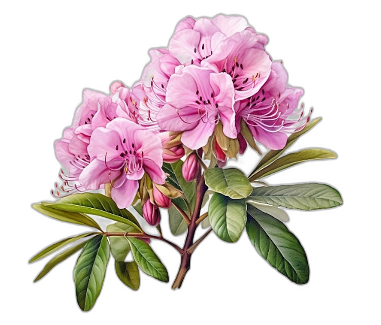
Here’s what the final result looks like.
The CSS
It’s pretty simple to implement this effect. In a nutshell, it’s a combination of the mask-image, mask-size, and mask-position used effectively.
So, for instance, if you want to place it on a <img> element, here’s all the CSS you will need.
img {
    -webkit-mask-image: linear-gradient(45deg,#000 25%,rgba(0,0,0,.2) 50%,#000 75%);
    mask-image: linear-gradient(45deg,#000 25%,rgba(0,0,0,.2) 50%,#000 75%);
    -webkit-mask-size: 800%;
    mask-size: 800%;
    -webkit-mask-position: 0;
    mask-position: 0;
}

img:hover {
    transition: mask-position 2s ease,-webkit-mask-position 2s ease;
    -webkit-mask-position: 120%;
    mask-position: 120%;
    opacity: 1;
}
Explanation
As you can tell, the mask-image is a linear gradient that is at an angle of 45 degrees. The mask-size is set to 800% which means that the gradient will be repeated 8 times. And the mask-position is set to 0 which means that the gradient will start from the right.
Next, on hover, we are animating the mask-position to 120% which means that the gradient will move from right to left. And the transition is set to 2s which means that the animation will take 2 seconds to complete.
You can play around with the mask-position in the hover to make the shine move faster or slower. Setting opacity to 1 will make the image visible when the animation is complete.
And that’s it. Pretty simple, right?
If you’re interested in creating a logo animation or exploring the power of an animation maker for your designs, check out Adobe’s create logo animation tools and resources to experiment with similar effects for your projects.
I have also created a CodePen demo for you to play around with. So, go ahead and check it out.
See the Pen Shine animation on hover by Amit Merchant (@amit_merchant) on CodePen.

👋 Hi there! This is Amit, again. I write articles about all things web development. If you enjoy my work (the articles, the open-source projects, my general demeanour... anything really), consider leaving a tip & supporting the site. Your support is incredibly appreciated!
