Things I did to improve my blog over years
When I started my blog three years ago, I didn’t intend to blog on a regular basis. Back then, I used to write about things which I learn on a day to day basis but that wasn’t very often. My frequency of posting an article was 1-2 articles per month.
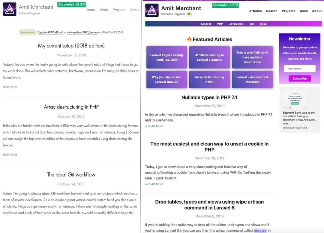
The UI of my blog was also pretty much basic and flat. To give you some perspective, here’s how my blog looks like in 2019(on the right side) in comparison to 2018(on the left side).

My blog in 2019 vs. in 2018
The traffic, as you would expect was also very low. 20-30 unique users every day. But then one day, I noticed one of my articles related to Laravel’s egaer loading has started getting some traction. It was able to get 40-50 unique user everyday alone. That’s where it striked to me. I saw an opportunity to build an audience and to write the things people would actually interested in reading. But before continuing to do so, I was certain that the blog needs some improvements in terms of the design and aesthetics apart from writing frquently. So, I’ve started working towards the same. Here are few things I did to improve the usability and accountability of the blog, incrementally over the past few years.
Improved design
In terms of design, I was definite that I would need more call to action, using which the visitor whould not leave the site right after its one time visit. So, the first thing I did was, I added a header menu which consists of the top topics of this blog. These includes PHP, Laravel, JavaScript and so forth. This is how it looks.

Header menu of categories
This was an easy decision to make and one I think is very effective as well. It would essentially give the interested user the topic they are interested on a single page.
The other improvement I did in term of design was to add a grid on the home page which have featured articles, the ones which are most popular on the blog. This also serves the purpose of giving idea to the first time visitors what this blog is all about.

Featured Articles grid using flexbox
Next, on the article pages, I’ve added a segment called “You may also like” in the middle of the article which basically suggests the target visitor about a related article which they might like. Here’s how it looks like.

Related articles call-to-action
The last thing I did in terms of design was to make my blog from 1-column layout to 2-column layout. This decision helped me in moving some things such as newsletter box and advertisement to the right of the layout. I’ve implemented a 2-column layout using flexbox. I’ve made the second column as a separate component which I’ve used across the entire blog pages.
All of the above combined with a color scheme and gradients of those colors at places, I’ve made sure that the blog doesn’t feel boring anymore.
Added search functionality
The one prominent feature that was missing on this blog was a proper search because of a theme I’m using a jekyll theme which doesn’t come with a search functionality. So, I decided to implement one myself. And after some brainstorming, I’ve finally able to implement the search. Upon searching the search would try to find match title, url and category and would gives the results accordingly.
Fun fact: I extracted parts of above mentioned features as a separate theme. The theme is called as Reverie which is an extension to jekyll-now.
Added a RSS feed
An RSS feed is important for your blog if you want your audience to visit your blog again. RSS allows the content and new updates to come to the reader. Generally, you use RSS to syndicate or subscribe to the feed of a website, blog or almost any media content that is updated online.
I’ve leveraged the use of jekyll-feed plugin to generate an Atom (RSS-like) feed of all the articles.
Added a newsletter
I’ve started running a newsletter for this blog. So, once the user subscribed to it, they’ll get an email every week which will include all the newest articles I post on the blog. To manage my subscribers list, I’m using Tinyletters which is nice and has given me the ability to customize the newsletter design according to my needs.
Added a contact page
The last thing I did to make the blog a little interactive is by implementing a contact page where visitors can give suggestions, improvements and ideas regarding the articles they are interested in. This has helped me in knowing the taste of my blog’s visitors. So, based on this insights I can choose the right topics to write.
👋 Hi there! This is Amit, again. I write articles about all things web development. If you enjoy my work (the articles, the open-source projects, my general demeanour... anything really), consider leaving a tip & supporting the site. Your support is incredibly appreciated!


