Balanced text wrapping is coming to CSS
That's the new text-wrap property.
The CSS Working Group has recently published a new draft of the CSS Text Module Level 4 specification that introduces a new property called text-wrap that allows you to control the wrapping of text in a more granular way.
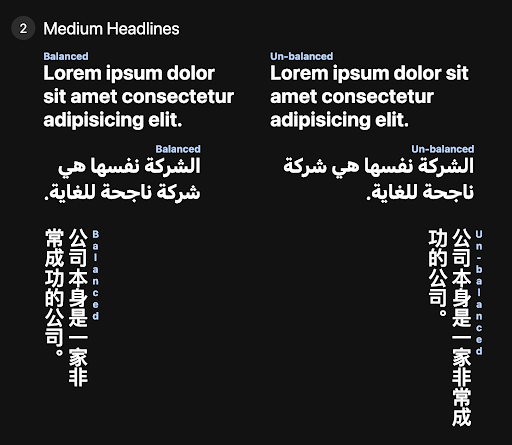
Essentially, the text-wrap property will let browsers wrap text in a way that looks balanced for better readability and to prevent typographic widows. More specifically, when the text-wrap property is set to balance, the browser will try to wrap the text in a way that the last line of an element is as long as the first line.
As you can expect, this can be pretty useful for making headlines look better.
Here’s how it would look like courtesy of the tweet by Adam Argyle.
Although the specification is still a draft, it seems like the feature is in the “likely to ship” phase for Chrome which means it’s likely to be shipped soon. Most probably, it will be available in Chrome 113.
But if you want to try it out right now, you can use the text-wrap property in the most recent Chrome Canary build.
Hopefully, more browsers will follow suit and implement this feature soon.
Learn more about the text-wrap property in this video by Una Kravets.
`text-wrap: balance` in action 🎬 https://t.co/dzSVk7KLwV pic.twitter.com/6pI4aoRQaA
— Una 🇺🇦 (@Una) February 28, 2023
👋 Hi there! This is Amit, again. I write articles about all things web development. If you enjoy my work (the articles, the open-source projects, my general demeanour... anything really), consider leaving a tip & supporting the site. Your support is incredibly appreciated!


