Making my VS Code minimal and distraction-free
Before proceeding on describing all the customizations I made, I have a confession to make.
“I love VS Code… I freaking love this editor!”
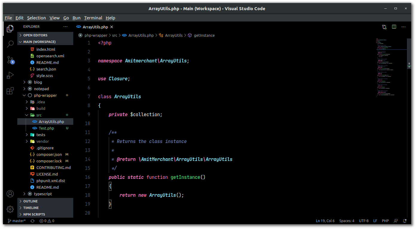
While I as much as love the simplicity and extensibility of this editor, I tend to hate the chaos that the default layout of it brings. Clutters such as activity bar, status bar, sidebar consumes staggering screen space which otherwise would be useful for doing the main task that I’d be using it in the first place. Below is the setup I was using previously…
This looks pretty congested in my taste and in addition to this, I’m using a 15” laptop and because of that, I tend to get even less space.
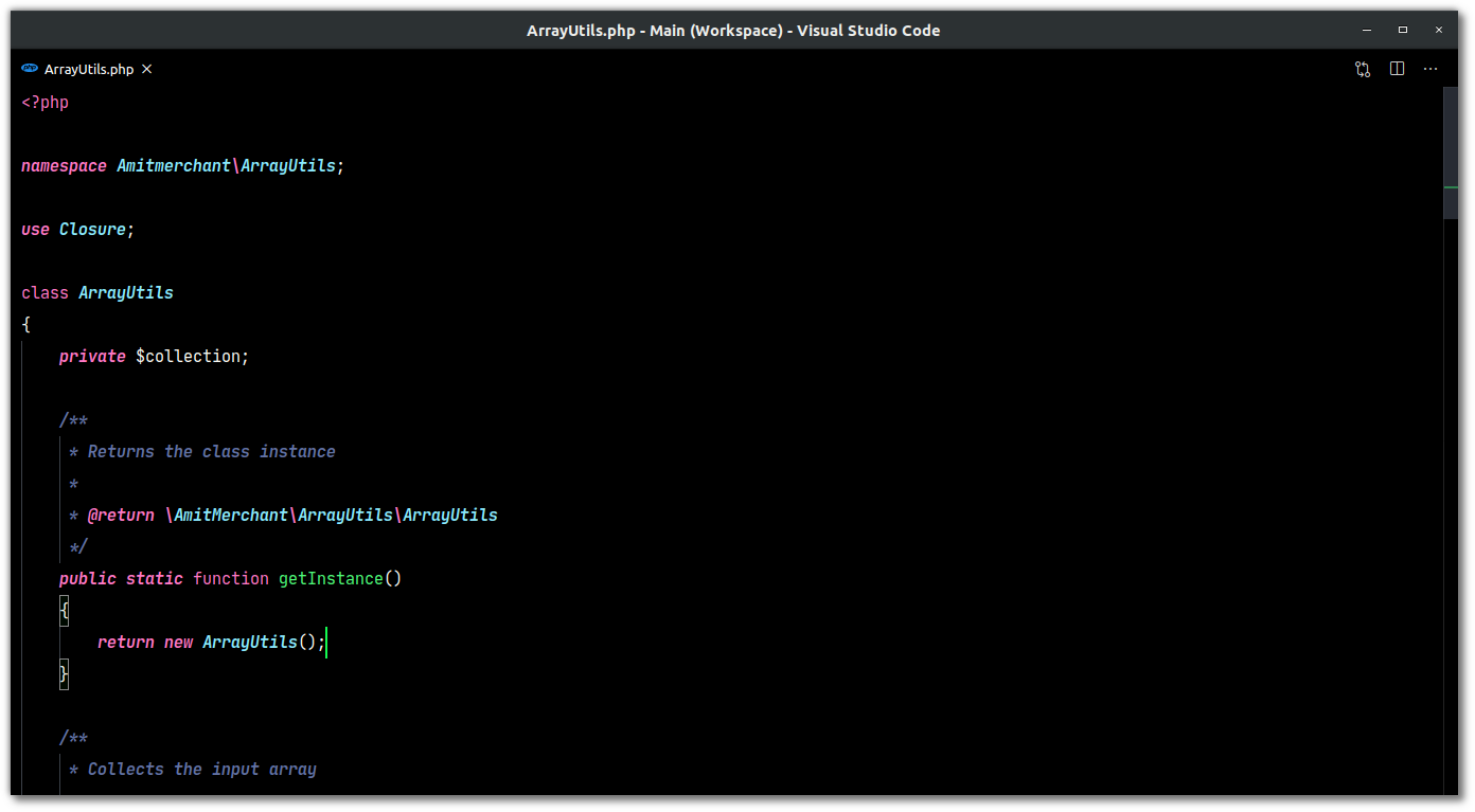
Thankfully, VS Code is very customizable even when it comes to changing its overall layout. And so, I tweaked some of the built-in default preferences of VS Code. And after applying those tweaks my editor now looks like below.
Pretty clean, isn’t it? If you find this interesting, I’ll walk you through all the settings using which you can also make your VS Code look like this.
- Remove Status Bar
- Remove Activity Bar
- Remove Side Bar
- Remove Minimap
- Remove Menubar and Gutter (Line Numbers)
Remove Status Bar
First, let’s get rid of the status bar which lies in the bottom of the editor which shows the file language, current line and column numbers, and a few Git related things. I personally don’t make use of the status bar and so, I removed it.
To remove it, open command palette (Ctrl + Shift + P) and search Toggle Status Bar Visibility and select it. This will remove the status bar from the bottom.
Remove Activity Bar
Next, let’s get rid of the Activity Bar which sits in the far left. This provides a UI to access Explorer, Search, Source Control, Run and Extension panel. But we have been given shortcuts to access all these panels even if we don’t have the Activity Bar enabled. Below are all the shortcuts to access different sidepanel areas.
- Explorer - Ctrl + Shift + E
- Search - Ctrl + Shift + F
- Source Control - Ctrl + Shift + G
- Run - Ctrl + Shift + D
- Extensions - Ctrl + Shift + X
It’s just a matter of remembering these shortcuts and we can safely hide this Activity Bar as well.
To do this, open command palette (Ctrl + Shift + P) and search Toggle Activity Bar Visibility and select it. This will remove the activity bar.
Remove Side Bar
Next, we can proceed to hide the entire sidebar which holds the explorer, the source control, search, and extension panel.
For this, open command palette (Ctrl + Shift + P) and search Toggle Side Bar Visibility and select it. This will remove the activity bar. Of course, you can toggle the visibilty of the sidebar anytime you want.
Sweet! At this point, your editor would be looking much cleaner and sober than before but we still have work to do.
Remove Minimap
Next, we’ll aim to remove the minimap that comes in-built and can be seen far right. It has the sole purpose to give you a high-level overview of your source code. Personally, I don’t rely upon it and so I’ve removed it as well.
To do this, open command palette (Ctrl + Shift + P) and search Toggle Minimap and select it. And bam! The minimap is gone as well!
Remove Menubar and Gutter (Line Numbers)
Now, the only thing remains is to hide the menubar and remove the gutter that shows line numbers and the ability to fold the code.
First, let’s remove menubar. To remove it, Go to View > Appearance and toggle “Show Menu Bar” option. This will hide the menubar. But, if in any case, you want to access it, you can do it by pressing Alt, and it’ll appear right there.
And to remove the gutter, we have to change a couple of settings. For that, go to the “Settings” and find the below preferences and change those values as I mention here.
"editor.lineNumbers": "off"
"editor.glyphMargin": false
"editor.folding": false
And with that, your editor should be looking like the way I’ve shown previously. Clean, minimal, and beautiful!
Of course, to go back to the default layout, revert all these settings and you’ll get the good old VS Code back.
And if you’re wondering which color theme and fonts I’m using? The answer for that is I’m currently using a theme called Hyper Dracula which is a ultra dark variant of the popular Dracula theme and fonts that I’m using are JetBrains Mono.
If you’re a visual learner, I’ve made a video of the entire process which you can checkout as well.
👋 Hi there! This is Amit, again. I write articles about all things web development. If you enjoy my work (the articles, the open-source projects, my general demeanour... anything really), consider leaving a tip & supporting the site. Your support is incredibly appreciated!


